Posts

Showing posts from 2011

3aib.

Image
It's a shame (3aib) when a college of  design  (and other majors including English) produces such booklet to showcase their portfolio, facilities, courses and programmes. Lets go through it before I start talking in details. It took me almost 3 weeks to blog this specific booklet out of my chest. Every time I sit infront of my laptop trying to put my river of thoughts into words; my hands shiver, smoke comes out of ears and my face turns into a red balloon filled with anger and frustration ready to explode! Maybe because it isn't only about this booklet, but its the whole experience, from landing a foot on the college grounds to running back to my car. The experience also has to do with the college's dean who asked me - when I went to apply for a job as a Typography teacher - he asked "What do you mean by Typography?" (!!!)  I felt like a bucket of cold water got poured over my head . I instantly thought to my self "Is this really where I want to work?

AMBIENT... Welcome to Oman!

Image
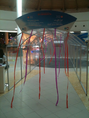
Hala! Putting my 'ambient advertising' hat on for a change. We don't see much of ambients in the GCC as much as we do overseas, maybe 'cause we have alot of restrictions or maybe 'cause Arabs don't interact as much. People are not exposed to such things, and are a bit hesitant to go and ask or be part of, but nevertheless, this ambient idea kicks ends! So, What's  Ambient advertising?  Ambient advertising  slowly started making itself known towards the late 90's. It refers to all advertising that is out of home and non- tradtional - it is exciting, fun, targeted and engaging.  Alright, moving along.. This ad is for General's New Super Cooling (Super Wave/Super Power/ Super Quiet) Features: 5 speed control 30% improved powerful airflow 15m Long-reach airflow. (Excuse the quality of the pictures.. I only have those two crappy ones. I got caught by security. No pictures are allowed to be taken inside the mall -

Arabic Laziness!

Image
Hello, Went to Carrefour the other day for some grocery shopping. Found this roll-up banner on the way out. Not bad. The msg is clear. The design is simple. The font is....... WHAT?! Ok guys, I gave you credits for the design, clarity, legibility, and concept overall, but why isn't the Arabic font matching the English? The English and Arabic copy are acting as a unit, which is great! Shouldn't the English and the Arabic fonts be the same in design since they both convey the same msg? The English font is fantastic! You used some handwriting font on a post it, BRILLIANT and makes complete sense, but couldn't you copy the same for Arabic? It's easy to do on Illustrator; outlines the selected font, then start drawing those 1/4 hatches! Nothing else to say. Obviously the main design concept was executed in English then the Arabic translation was added to it. "Call us we'll answer" is another example at the bottom of this same banner! The Ar

On/Off.

Image
Salam and Happy Eid to all, Right! So, went Eid shopping with my sister and entered a shop called  Jeans West .  She started trying on some jeans, while I was seated on the chair besides the changing room handling her different sizes, and so, I noticed this... While the door was locked, she had her Denim Off And while the door was unlocked; she had her Denim on, so it was fine to open the door. Now seriously, how cool is this idea?! I absolutely LOVE IT! Although the production was cheap; it was printed on some home A4 paper and Impact was the font used, but who cares right now!? I'm fascinated by the idea and the way it was delivered; simple, clear, creative.  Sometimes you don't need all the extra graphics and bits. Using your guideline's colours with some simple smart copy, makes a great attention grabbing design.  Enough said. This made my day. I'm happy! With design, SF.

"Just to provoke"

Image
Hello all, The whole mall is on sale. Isn't that wonderful news?! I can look for something new. Something new like SALE signs, window displays, ads, danglers... whatever! :D Terranova  is an Italian brand gone international for  Clothing and shoe fashion.  They have branches in London and France to name a couple. Terranova is owned by some Lebanese in Oman. They've decided that this is the best way to go about their shop sale display design. According to what he said, they know exactly how to promote themselves. Fair enough. Hands down. Now lets see what they did. As you can see in the pic above. The owner was staring at me wondering why the hell was I taking pics. Then he approached me and asked, EXCUSE ME. WHY?! - I criticize ads = From what magazine are you? - No magazine. I do this for my personal blog. = Website?! - Yes. website! Your window display is intriguing!  = *chin up, very proud* Yes I did that on purpose.  - but you're telli

Now available in Arabic but in English!

Image
Salam, Ok... Lets look at this then start analyzing I'm speechless. This so called "ad" has been done in an hour, ermm maybe less - to be fair ya3ni. Do you see a concept?? Done done and over done with the phone msg trying to tell the reader something. But the funny part is that this ad has been running in an English newspaper while the message is targeting Arabic readers. "our mobile banking services are now in Arabic".. Hmm?? I'm not saying that Arabic readers can't read English, but if they can read English why would they be applying for this service? Design wise. No comment about the red swashes and jumping out text with black shadow. BankMuscat *buzzer*, your new HQ is quality and so should be your advertising! Rating: Layout over all:  1/5 Colours: 1.25/5 Font: Legible 2/5 Concept: (Is there one?)  Execution: 1/5 (for applying the guidelines only) With design, SF.

R.E.S.P.E.C.T for this ad.

Image
Here's a nice simple one!   This screams out youtube as soon as you see it... ermm.. that's if you're familiar with the logo ofcourse.  And if you get it, then you are Omantel's target in this ad. Since its an Omantel ad + youtube then = this definately has something to do with speed or fast broadband connection. There you go, I've done the math without reading anything so far, which means this megacom works in seconds. For those who didn't get the ad. You might get the other ad in the campaign that mimics the Google logo. I don't have a picture of that. Will try to find it and upload it. Found it!!.... look at this     Now I'm not too sure if this has been done before. I think it has been, I just don't have anything to prove it. So, for now, this wins.  Simple, creative, straight to the point are the key words we should always look for in an ad. Remember, creativity doesnt have to be complicated. 

This is not an ad.

Image
Right.. back on. Attached below is an official document that I got from ministry of Manpower here in SULTANATE of Oman. I'm embarrassed for them. And I'm also embarrassed as an Omani to see this huge spelling mistake on some official government document. This gets sent out to everyone not only locals.  I didn't know that a document as small as this should to get proof read first! No further comment your honor. I rest my case! With design, SF.

Where's the cover image?!

Image
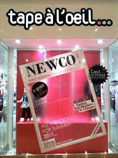
Window displays are a reflection. A reflection of the shop. What the shop has to offer at that season.  Its the same with us as humans, what we wear on the day reflects our mood.  Window displays are a teasers to ur way inside. They either grab your attention at a glimpse and drive you into the store or fail to do so. You're the judge. Usually, for that specific reason, the shop HQ would release a window display design and distribute to all its branches around the world. To synchronize all, and to deliver the same message at the sametime. So, for example Zara windows in Oman should match Zara windows in London. Oh! but thats only if its the same collection. Say, when its winter in Oman, its Summer in Australia, therefore the display wont be identical. Got it? :) Now after that introduction of mine, lets have a look at the image attached below. tape -à-l' oeil  which means flashy or high profile sells fashion from ages 0 to 14.

Striking layout!

Image
I like! I like! I like! Look at this piece of art. Was waiting for my fries to fry in the kitchen, while I was going through Times of Oman newspaper. And look what I found or shall I say, it found me! Seriously! it just jumped out and caught my attention. I saw this striking layout. I feel like hugging whoever designed this page in perticular. Look at it !! isn't it beautiful? Compared to the page next to it? Its just clean, elegant with fantastic use of space. It barely looks like a newspaper article! Finally a great use of white space and a smartly-put layout. Thumbs up! I like how the models shadow is overlapping the green block, which means breaking the guidelines, which means taking a risk for a change and doing something different. I like how the text is nicely rendered around the models curves. I like the balance of the whole page. Balance doesn't mean symmetrical, right = left, but its visually balanced - image and copy-wise. See! the

Frog legs!

Image
Alright. Just to let everyone know that I dont look for bad ads to critisize them, but I also look for the good ones to give them some credit. However, the bad ones seem to stand out a bit more than any others. Maybe coz they're just BAD. This is an ad for Hayyak (prepaid phone credit) from Omantel. To be promoted during the Muscat Festival 2011. Lets start with the goods. Love the simplicity of the msg and font. I like how they put a hint of the festival at the back, no clutter, clear blue sky no clouds and a well styled up model. Festival = youth = jeans and jumper that match the climate at this time. Moving along.. Now as soon as I saw this ad, my direct attention was to the frog legs! Isn't his jump weird?! I'm sure they took several shots prior to "frog legs" stage. Aren't there any better ones like the ones below? Something with more of a happy, dance, side shot jump? Something more attractive with closed legs?!!