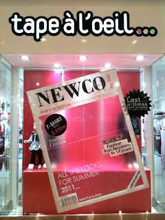
Where's the cover image?!
Window displays are a reflection. A reflection of the shop. What the shop has to offer at that season.
Its the same with us as humans, what we wear on the day reflects our mood.
Window displays are a teasers to ur way inside. They either grab your attention at a glimpse and drive you into the store or fail to do so. You're the judge.
Usually, for that specific reason, the shop HQ would release a window display design and distribute to all its branches around the world. To synchronize all, and to deliver the same message at the sametime. So, for example Zara windows in Oman should match Zara windows in London. Oh! but thats only if its the same collection. Say, when its winter in Oman, its Summer in Australia, therefore the display wont be identical. Got it? :)
Now after that introduction of mine, lets have a look at the image attached below.
tape-à-l'oeil which means flashy or high profile sells fashion from ages 0 to 14.
Looking at the window display which is a representation of a magazine cover, looks great and I like it. It does stop you coz there's a concept behind it and it just looks different from any other display in the mall.
However, I'm wondering, shouldn't a magazine cover have mannequins in the empty space or some sort of image to reflect what's inside? hmm?
In the real world, that would be the case; cover image + headlines. Now, that would make perfect sense! But this case is different. Its just a transparent blurry sticker!
Since the headlines read "T-shirt for 2.500 RO", "Fashion from new born to 14 years", and "All the looks for summer 2011", shouldn't there be a kid mannequin representing that?
All I see now is the previous season display in the background on the pink platform and a pointless magazine cover. It's basically just there to be there! does that make sense? Let me put it in simple words, it's a frame without a picture!
Seems like the people who work there didn't even understand what/why/how they glued that on the window.
Seriously, the magazine has to have an image, something the titles link to. This is just .... !! NOTHING. No meaning, no point.
There you go, good concept gone to waste! or shall i say good concept incomplete. Flashy? Yes, but meaningless.
Oh and btw, I don't mind the tilt. Its ok. It gives some playful character to the shop.
I took this off their website. This is how it should be.


whats botherin me (apart from the big fat FAIL in applying the concept) is that the sticker is opaque. a blurry image isnt selling clothes all that well :S I wonder how this was intended to work all together..?
ReplyDelete