Stay away from GOLD.
 |
| Bonus: The copy in the mupi is not aligned properly. |
*deep breaths*
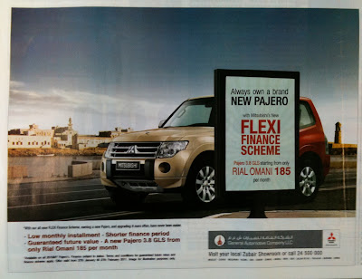
Lets now look closely at what the ad is saying without reading the copy -
To me as a viewer, it says when you pass by the mupi (where the main msg is) your car turns from a nice red to some sand colour, one. Two, you'll still be crossing old oman in the background, but camouflaged this time. Coz your car will match the background!
Wait a sec? are u trying to say my car wont stand out? Crap! i don't want that PAJERO!
I tried reading between the lines, I asked a designer friend, but we both still find it hard to link the image with the msg. Is there a catch in the copy? not really. They only talk about what you get from this offer.
I presume what they want to say is that this offer is so "Flexi." You can decide on whether you want your car to be gold or red, but hmm, why from bright red to GOLD! Why?! coz Gold = Luxury! oh yes! how stupid of me! of course it is. DUH! People love gold here! They'll ditch red for it! can't you see how gold is SHINING SHINING ! BLING baby! Araboo style!
Seriously people, cut the crap.. don't link luxury with yellow gold. STOP it. Lets move on. Lets have fresh colours in our ads. Something that attracts the reader, grabs his/her attention and most importantly sells the product. Yes, we do live in a rich country that has gold and oil. Yes, my grandma probably has a bucket full of yellow gold in her closet, but that doesn't mean we have to incorporate it in every single ad. Even cars?!
The car colours here make us read it backwards. Fresh to dull.*buzzer*
Plus i'm sure Pajero comes in other colours too! This colour is just washed out with the BG.
Onto the background image now. Yet another old Oman. Yes I will be driving in Matrah, but I'll also be driving in Shatti Al qurum, Shari3 el 7ob (flirting road)!
Your target audience here are people who can buy cars, pay monthly installments, go camping, enjoy driving through beach or desert sand.. etc. Mostly youth or older men who enjoy going to such places.. So why give them the most boring colour car when they're full of life and adventures?
I think this ad is focusing on the word old with a fresh new offer. Contrast? nope. Confusing!
Rating:
Layout over all: check 4/5
Colours: Boring 1/5
Font: Legible 4/5
Concept: 0.5/5
Execution: down on the alignment 4/5
With design, SF.


So basically gold is old :P another good catch!
ReplyDeletehahaha.. yes its the opposite here ;)
ReplyDeleteChange red to silver and gold to red, change the background to some attractive desert with people camping(a bonfire is a plus) and it will attract the targeted audience you mentioned above.
ReplyDelete