HM wearing Birkenstock
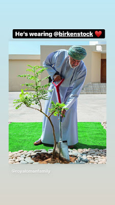
Salam all, so let's start with the latest, then i'll post what i've saved earlier. yesterday, HM sultan haitham was planting a frankincense tree as an initiative and i noticed that he's wearing birkenstock. it is not odd to see birkenstock worn with dishdasha as many youngsters do it for comfort and practicality, but it's definitely never seen before on a royal let alone a Sultan. they are very similar-looking to the traditional pair we normally see on men, hence some replaced them with a more comfortable pair like birkenstock or cushioned strapped sandals. It's pretty cool to see the sultan is part of the trend. after noticing, i immediately posted about it on my IG story @sf.dsgn tagging birkenstock (global). im guessing i'm the only one who noticed coz i look into details that annoy a lot of people around me (lol), but hey, i'm originally a designer and as a marketer looking into details is part of my job. HM planting a tree wearing Birkenstock Af